Design Inspiration
Here are some photos of finished projects we supplied tiles for. A great way to find some inspiration for your next project.
Fairfield Project
SPACE CRAFT PHOTOGRAPHY
DESIGN FEEL: LUXE / MODERN / BOLD
Tiles used in this project: Milan Grigio Soft Honed, Milan Nero Soft Honed, Bluestone look porcelain tiles (with coping made for pool edge), 48x48mm Grey pool mosaics
The client for this project wanted to highlight the large open plan design while also creating impact with the choice of materials and finishes. Walnut tones, black and grey and high end was the brief. Our Milan series was the perfect choice for this house. It paired perfectly with the walnut cabinetry to create some very luxurious bathrooms. The tones of the Milan tiles flowed perfectly to the polished concrete flooring throughout the main areas of the house.
We continued the charcoal tones out to the entertaining area and pool area. Our 20mm Bluestone look porcelain pavers were used in these areas with coping made for along the edge of the pool. The grey pool mosaics flow almost seamlessly from the coping into the pool area. Who said pool mosaics have to be blue?
Essendon Project
OLARENSHAW + CO DESIGN
DESIGN FEEL: LIGHT / AIRY / NEUTRAL
Tiles used in this project: Marlow Cloud Matt, Kit Kat White Matt Mosaic, Milan Naturale Soft Honed, Palermo White Gloss
The owners of this house wanted to bring their home into the current era while still retaining some of the traditional elements. They required so much more storage space so dividing the current bathroom with a European laundry into a separate bathroom and laundry was a must!
The tiles are neutral and subtle, yet they still create depth and warmth in the space. By using a natural beige tone for the floor tiles, they blend well with the existing timber flooring throughout the main areas. The tile and tapware combination in the bathrooms is a timeless modern classic look. The clients wanted a modern classic feel in the kitchen. Shaker doors, modern black handles and matt rippled subway tiles all create a light and open kitchen that won’t date anytime soon.
Pascoe Vale townhouses project
MAICON DEVELOPMENTS
DESIGN FEEL: MODERN / MONOCHROME / ELEGANT
Tiles used in this project: Calacatta Polished and Urban White Gloss
Premier Traditional Homes
DESIGN FEEL: CLASSIC / PROVINCIAL / COSY
Tiles used in this project: Sabia White Matt, Carrara Herringbone Mosaic & Carrara Rhomboid (Cube) Mosaic
Reservoir Project
DESIGN FEEL: COASTAL / BRIGHT / INVITING
Tiles used in this project: Marlow Cloud Gloss, Softstone Grey Soft Honed, Albany Grey Matt, Palermo White Gloss, French Quarter White Lappato
The clients of this impressive new build had a clear eye for what they wanted these townhouses to look and feel like. All the tiles chosen were light and neutral so that the cabinetry, tapware and window frames could become a contrast and feature. All the larger format tiles have digital prints that replicate stone. This gives a natural warmth to the space through the patterning and variation in the tiles. By using the same tile for the floor and walls in the bathrooms, it helps the space feel larger as it flows and people's eyes are not drawn to the change of colour and texture between the floor and wall. This is something to consider when selecting your tiles for your bathrooms.
Have a finished project featuring our tiles? We'd love to showcase it on our website.
Click here to get in touch
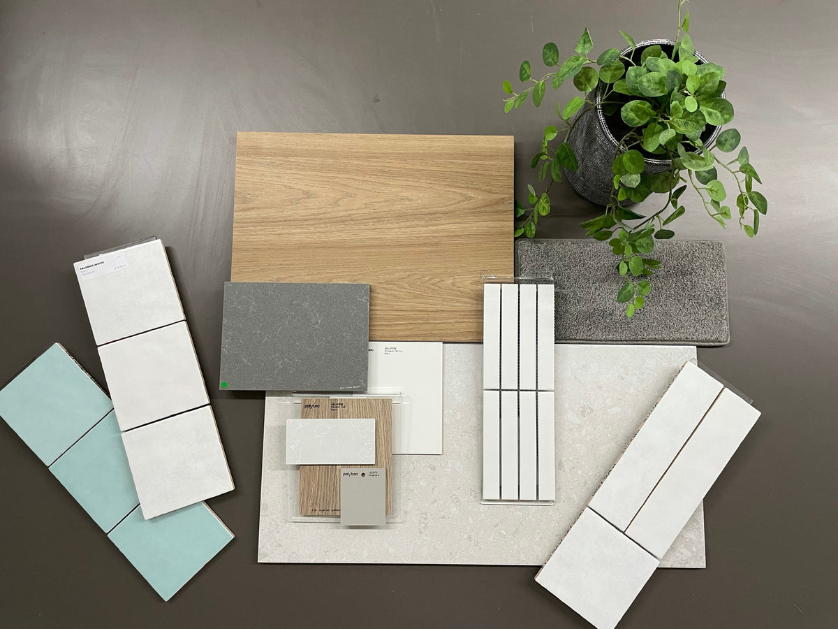
Feature Colours
If you want to incorporate a feature colour in your project through tiles, look around your home as inspiration. Often people lean towards certain colours they prefer without even realising. Be sure to get samples of the tiles you like so you can test the colours in your space as colours can look different in showroom lighting compared to your house.
Tile Choices
Don't be afraid to use one main tile for floors and walls in your bathroom. It will help make the space feel larger! Tiles now have so many different digital prints to choose from and you don't want too much pattern in your space if you choose different tiles for different areas.
Remember the Grout
Don't forget to consider the grout and caulking colour. This is a very important step that is sometimes overlooked by people. When choosing your tiles, also ask to see how the different grout colours work with the tile. Typically, people want a colour that blends with the body tile nicely. Sometimes people will highlight the grout in a feature tile...like a feature subway tile with contrast white grout.
Need some design advice? Struggling to choose the right tile combination?
Get in touch now
Send us an email now and let us know what you are currently working on and need help with. One of our showroom team members will be in touch to talk to you more and arrange a time to come in and go through some options.